Dollars to Doughnuts This Redesign Was Made to Scale
What did we do?
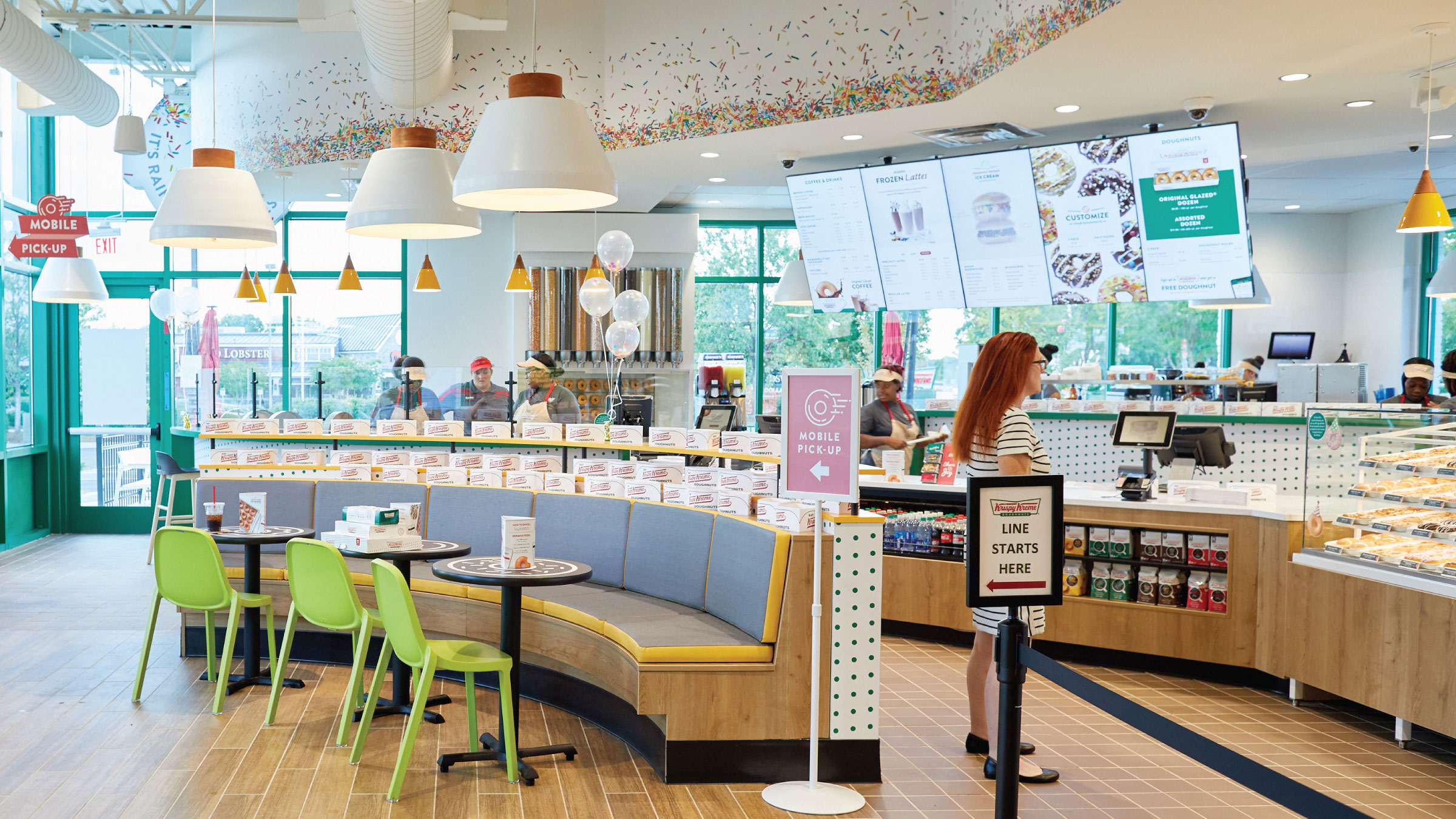
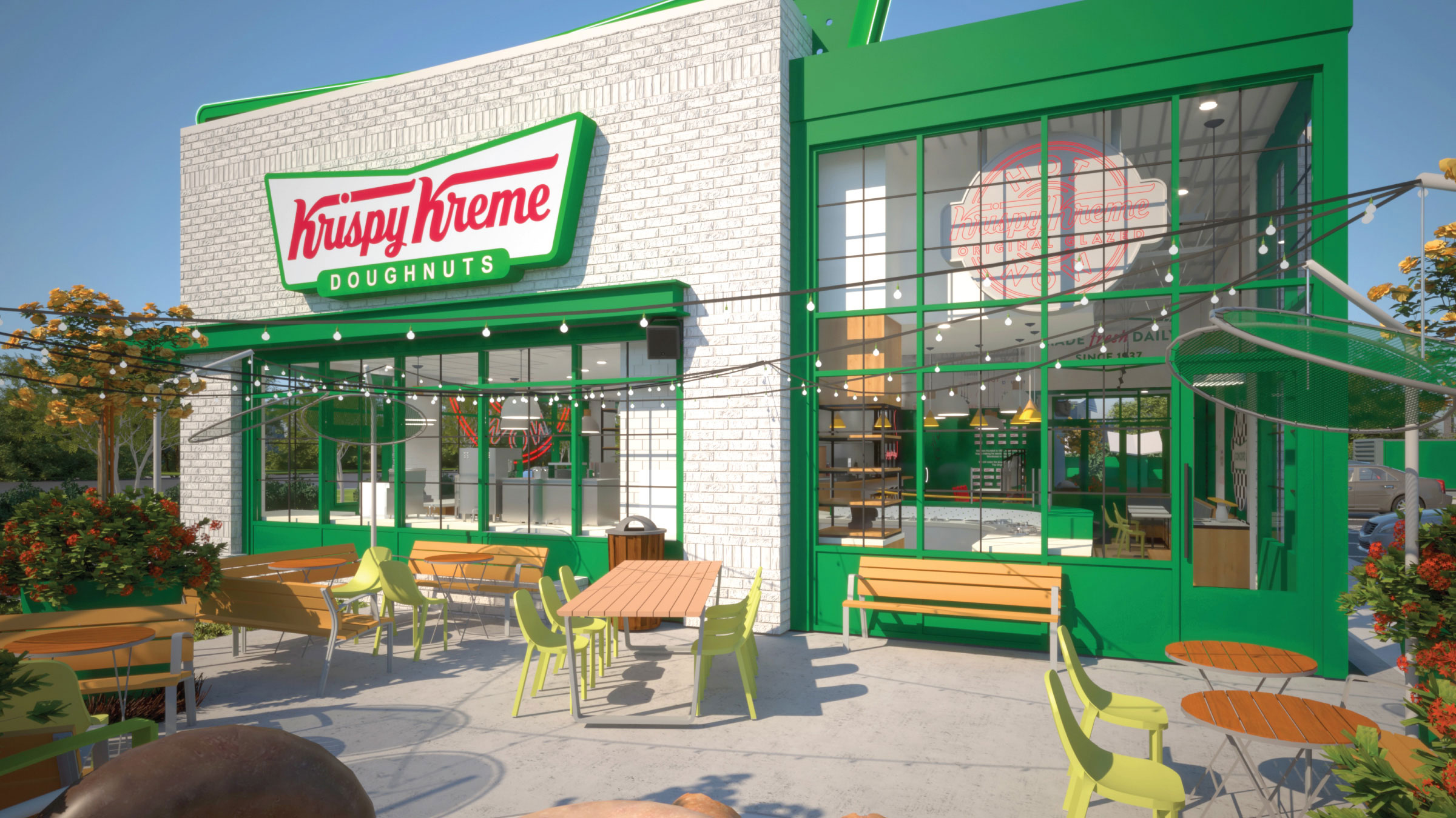
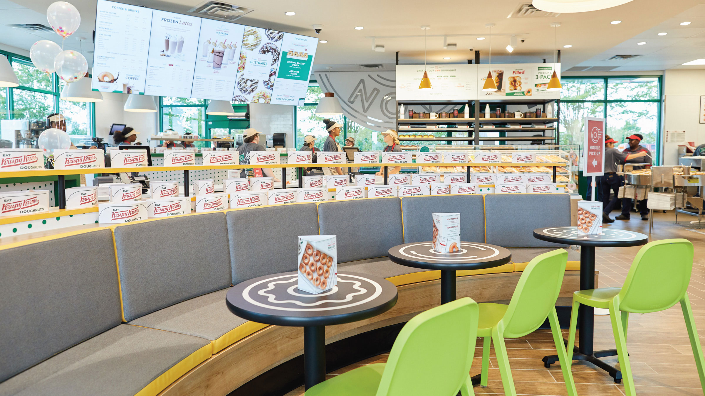
Comprehensively redesigned the iconic doughnut shop for the first time in more than a decade
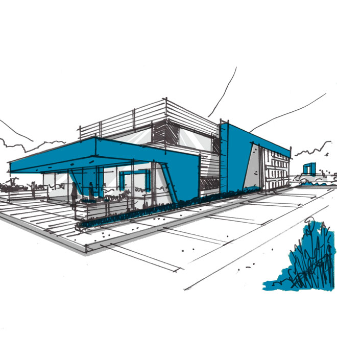
Developed a package that was less expensive—not to mention faster—to build than the prototype, and loved by customers and the client
Created a kit-of-parts design approach as a model for future stores
Enhanced the doughnut theater experience and ensured effective operations for new product offerings
"Taste Tested" dozens of Original Glazed for quality assurance
Solutions
- Brand Communications & Visual Merchandising

- Visual Merchandising
- Innovation & Experience Design

- 3D Renderings & Animations
- Environments Concept & Schematic Design
- Environments Design Development
- Innovation Workshops & Visioning
- Kit-of-Parts Development
- Multi-Unit Design Adaptation
- Operations Strategy & Design

- Engineering & Time and Motion Analysis
- Equipment & Space Capacity Utilization
- Foodservice Design & Documentation
- Operating Guidelines & SOP Creation
- Operations & Labor Assessment
- Store Planning (FOH & BOH)
Design
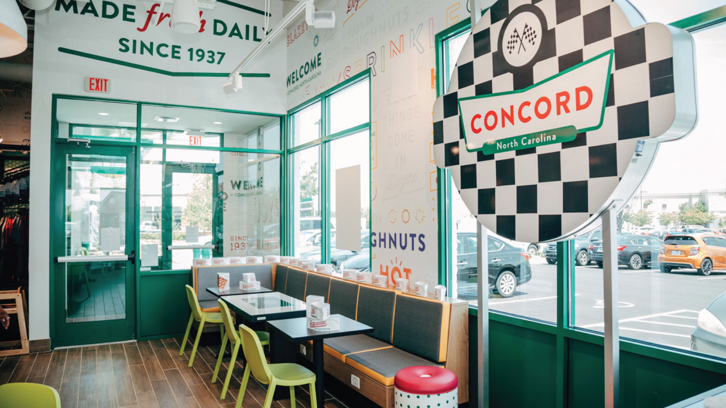
Upheld the iconic aspects of the brand while adding touches of local elements throughout the space


Operations
Improved workflow behind the counter and in the two-lane drive-thru to enhance the customer & employee experience


